Cient—Hydrow
Role—Senior Designer
Hydrow: It’s Your Element
↳ Web & Social
↳ Rebrand Exercise
↳ Branding
“It’s your element”—a promise that Hydrow
allows you to harness water to create your best self.
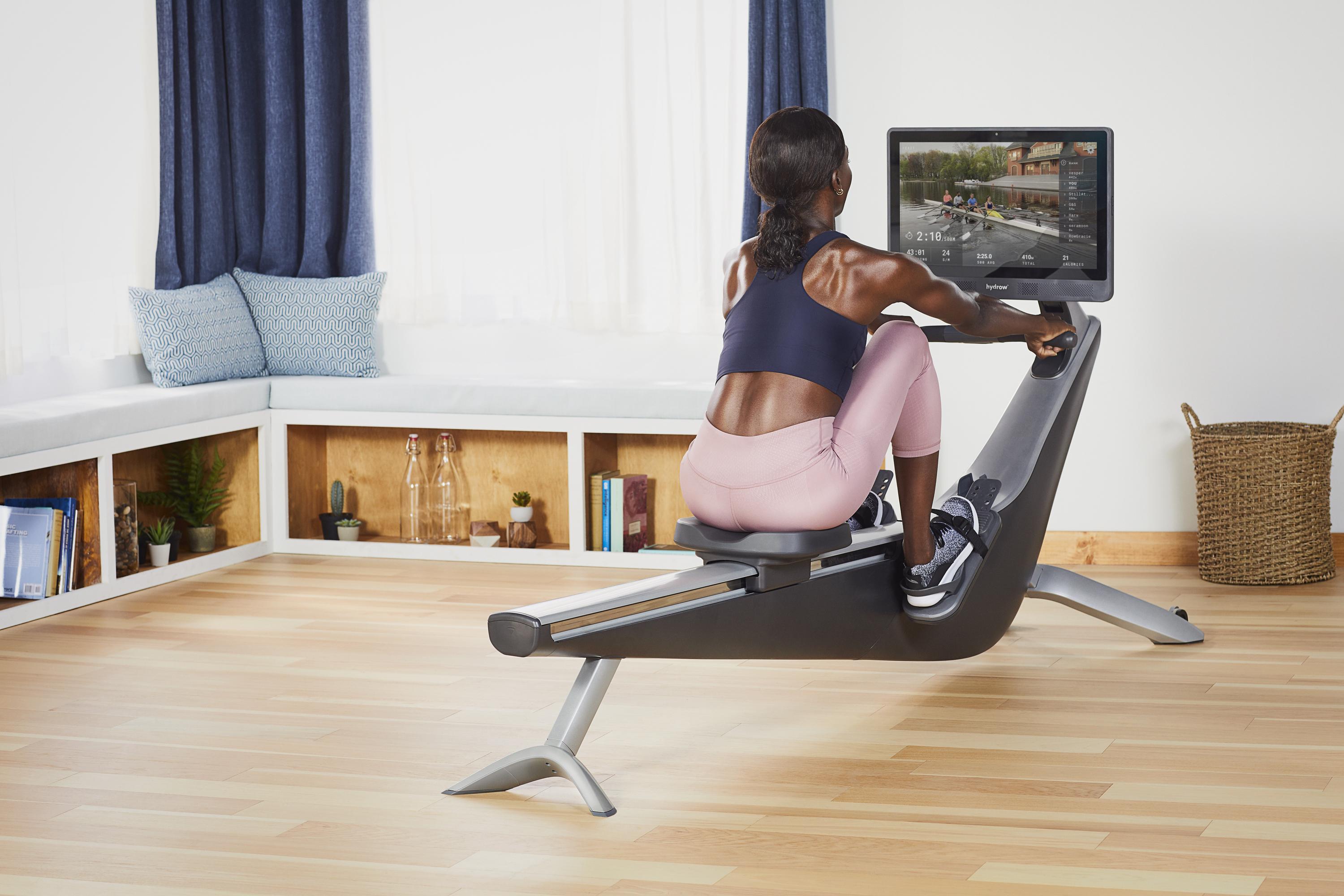
To that end, we’ll juxtapose jaw-dropping shots of athletes and nature as we follow water along its journey from inception on a mountaintop leaf, to a workout in a woman’s living room.
We’ll present Hydrow to the world as more than
a fitness machine: the natural evolution of water, itself.
Client—Hydrow
Agency—Laundry Service
Role—Design Lead, Senior Designer
Partners— J.J. Lim, Creative Director
Sean Hodes, Art Director
Aaron Marten, Copy Writer
↳ Rebrand Exercise
↳ Branding
“It’s your element”—a promise that Hydrow
allows you to harness water to create your best self.
To that end, we’ll juxtapose jaw-dropping shots of athletes and nature as we follow water along its journey from inception on a mountaintop leaf, to a workout in a woman’s living room.
We’ll present Hydrow to the world as more than
a fitness machine: the natural evolution of water, itself.
Client—Hydrow
Agency—Laundry Service
Role—Design Lead, Senior Designer
Partners— J.J. Lim, Creative Director
Sean Hodes, Art Director
Aaron Marten, Copy Writer
Design Elements
We wanted to provide a technical design to the rest of the look and feel for this campaign.
With thatm we’ve pulled a bathemtrics chart of the Charles River in Massechusetes.
One of the most popular rivers to row on. The chart shows the depth of water and
where shallow begins and where it gets deep. Rivers can be calm but some rivers
have more of an intensity to them that others may not carry. With the bathemetrics chart,
It conveys many levels of the river one may not know about and I thought it was
important to provide those details within the design.

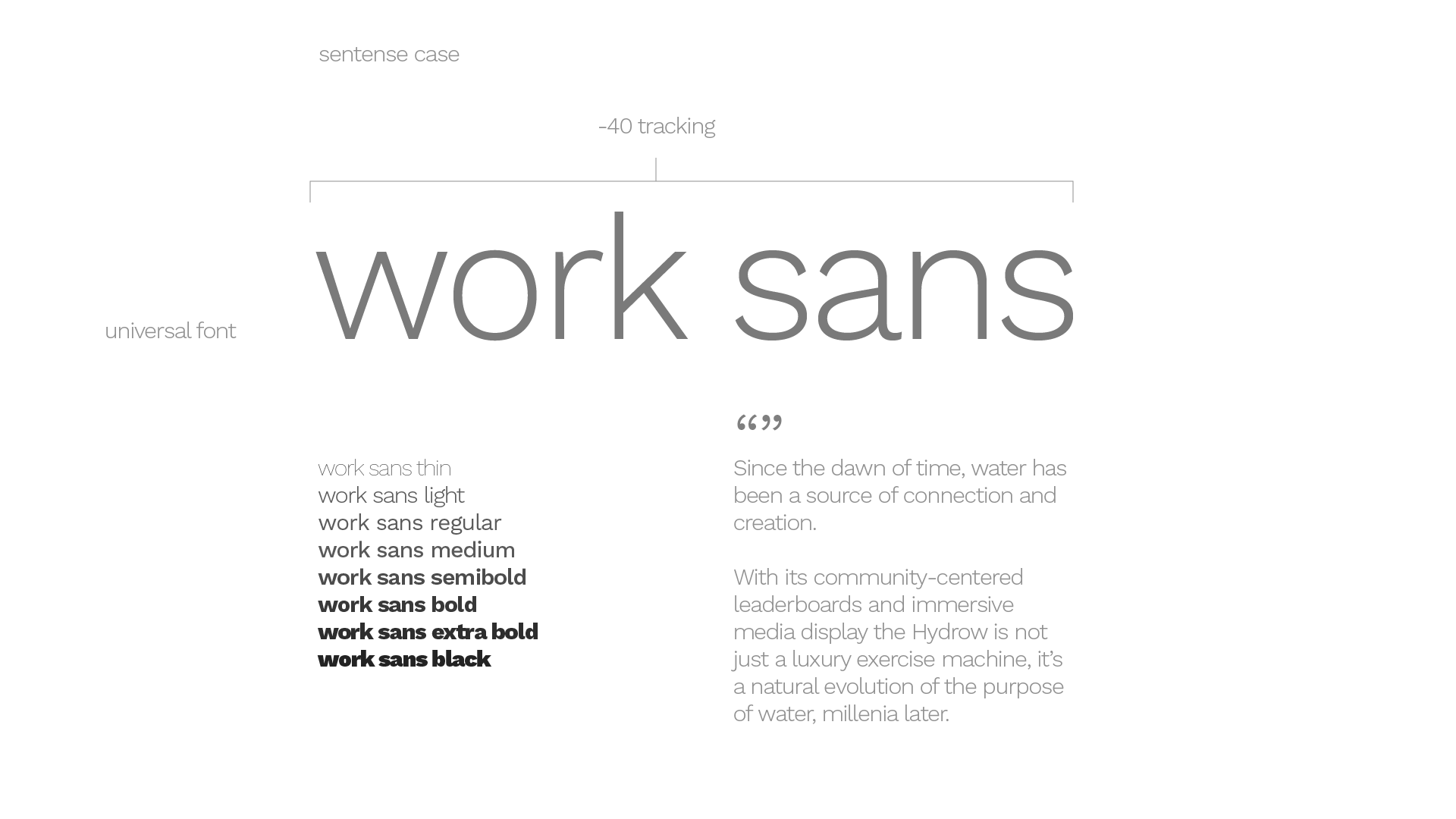
Typography
Work sans is a traditional universe font that was picked as their main typeface to use all around,
including headers, body copy to even the logo. Work sans was also used due to its elligant curvature.
Creates beautiful movement within the logo and bodycopy, almost as a representation of water.
Work sans is a traditional universe font that was picked as their main typeface to use all around,
including headers, body copy to even the logo. Work sans was also used due to its elligant curvature.
Creates beautiful movement within the logo and bodycopy, almost as a representation of water.
Logo Exploration
Here we explored using kerning, a thinner typeface, and the “y” descender as
an evolution of the current Hydrow rower. Inspired by the original logo, a key element
we wanted to maintain was the wave streaming under the base of the word. We want to further
emphasize this “rhythm” of rowing in the design because this is such an important piece of Hydrow’s identity.
We started by reducing weight, condensing letters and customizing
the ‘y’ to resemble an oar to create a more streamlined look.
![]()
![]()
![]()
![]()
(Above updated logo was not used due to usage of the original logo produced on the product.
Here we explored using kerning, a thinner typeface, and the “y” descender as
an evolution of the current Hydrow rower. Inspired by the original logo, a key element
we wanted to maintain was the wave streaming under the base of the word. We want to further
emphasize this “rhythm” of rowing in the design because this is such an important piece of Hydrow’s identity.
We started by reducing weight, condensing letters and customizing
the ‘y’ to resemble an oar to create a more streamlined look.


(Above updated logo was not used due to usage of the original logo produced on the product.
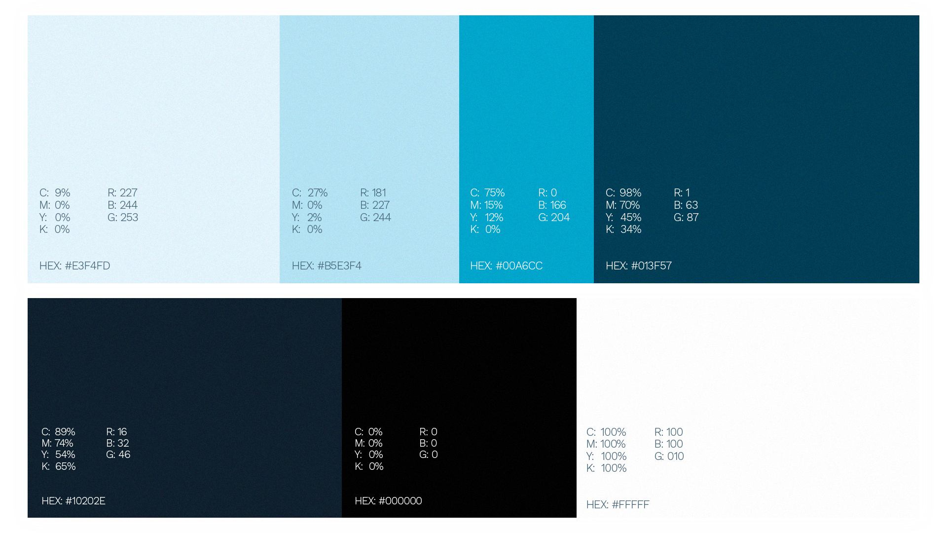
Color Palette
![]()
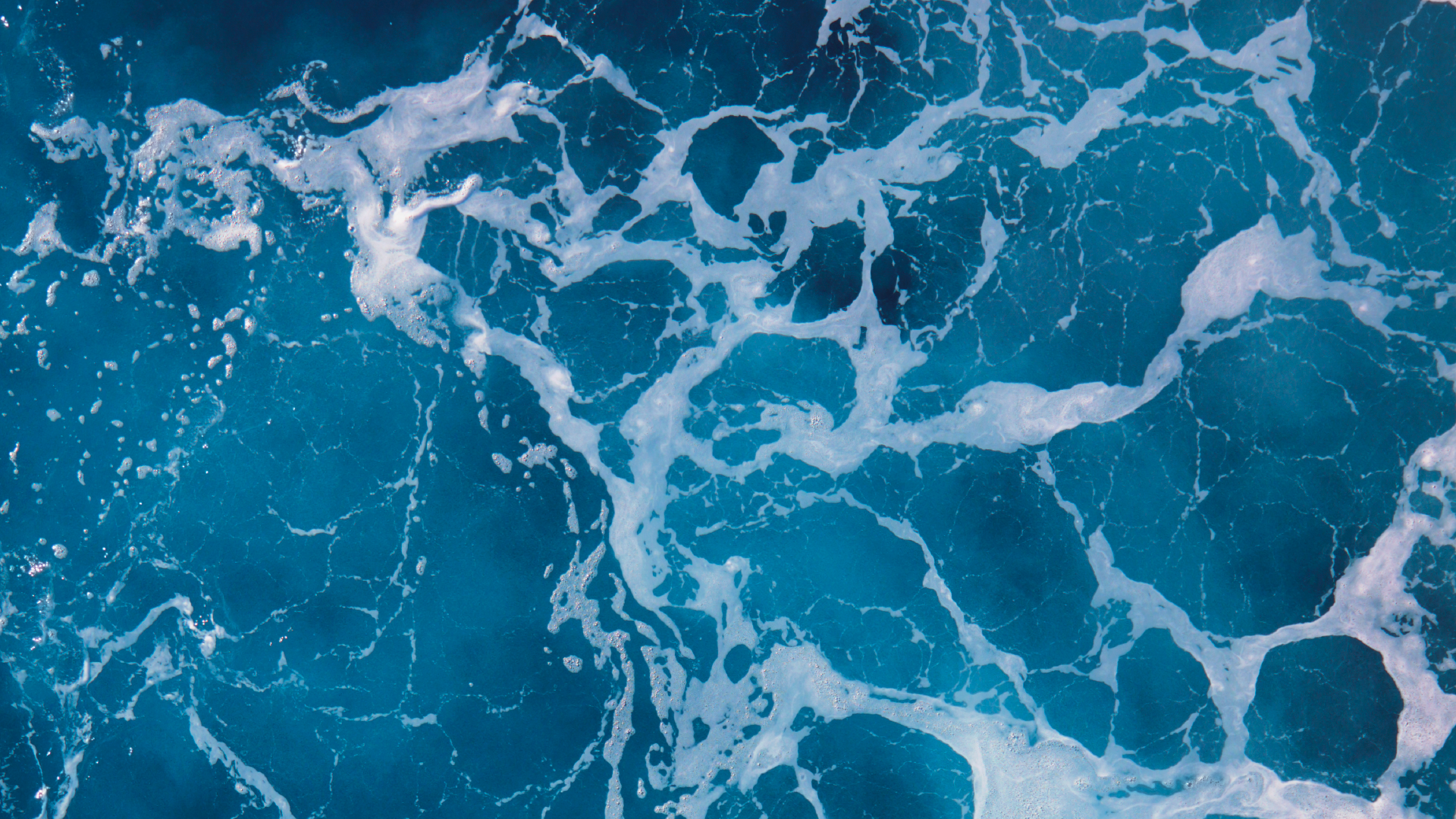
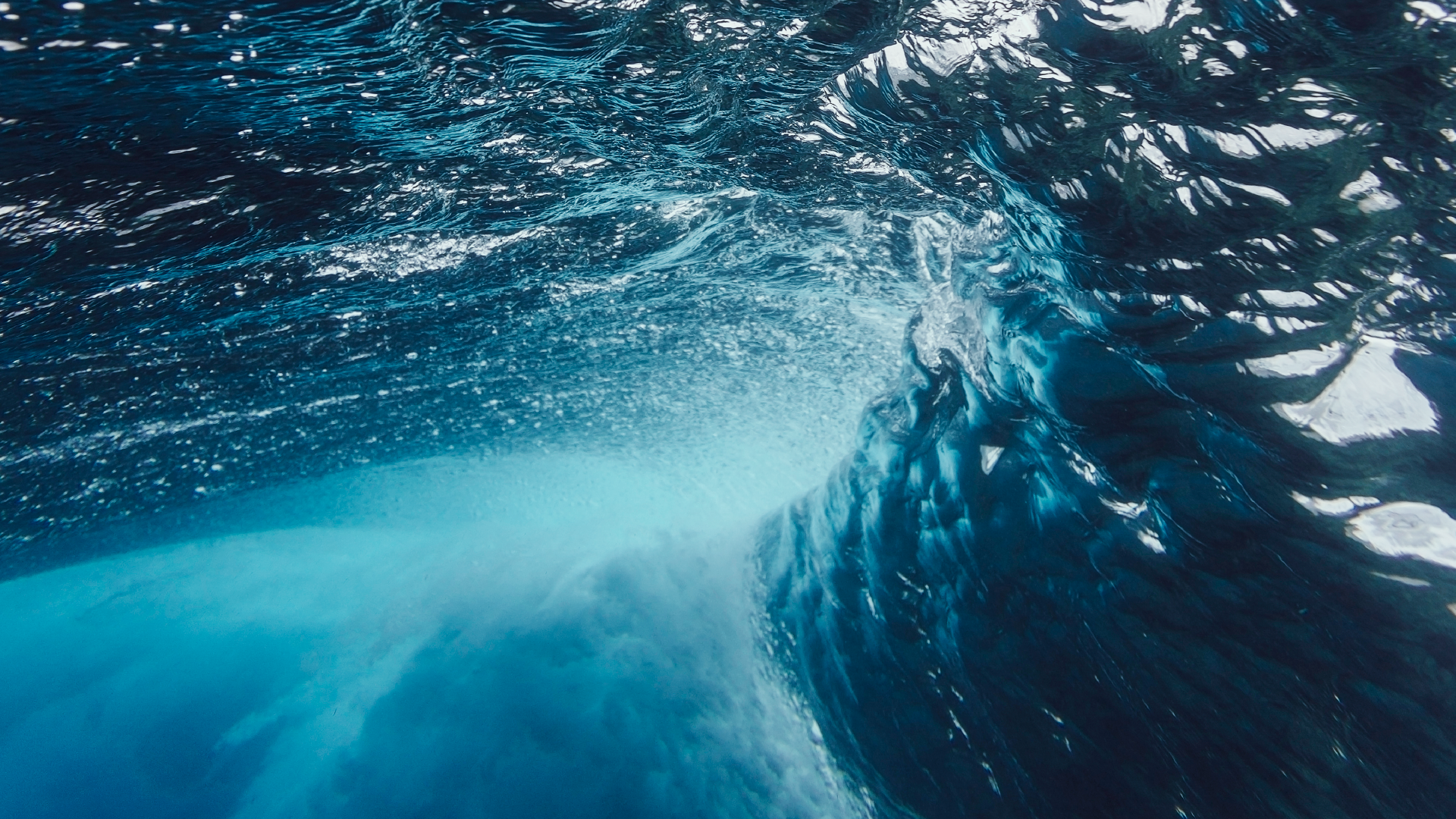
Levels of Intensity
![]()


Mobile Exploration
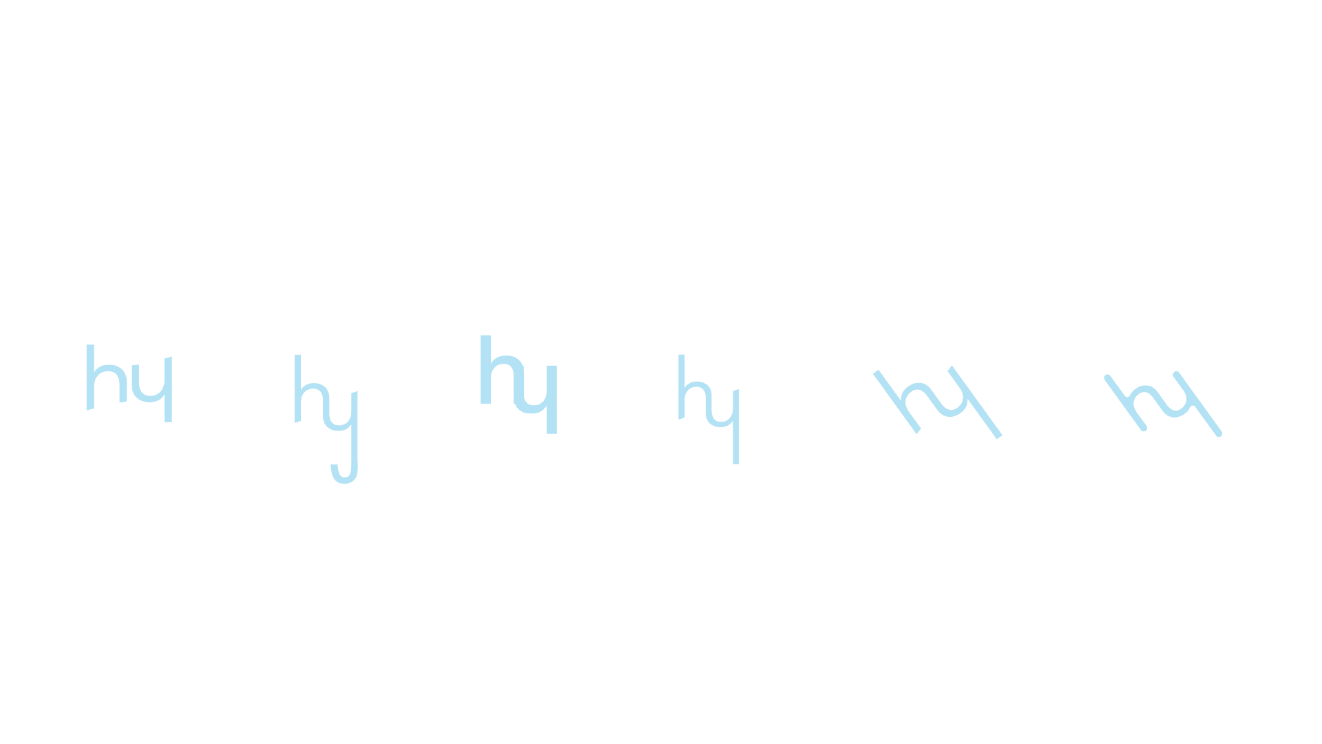
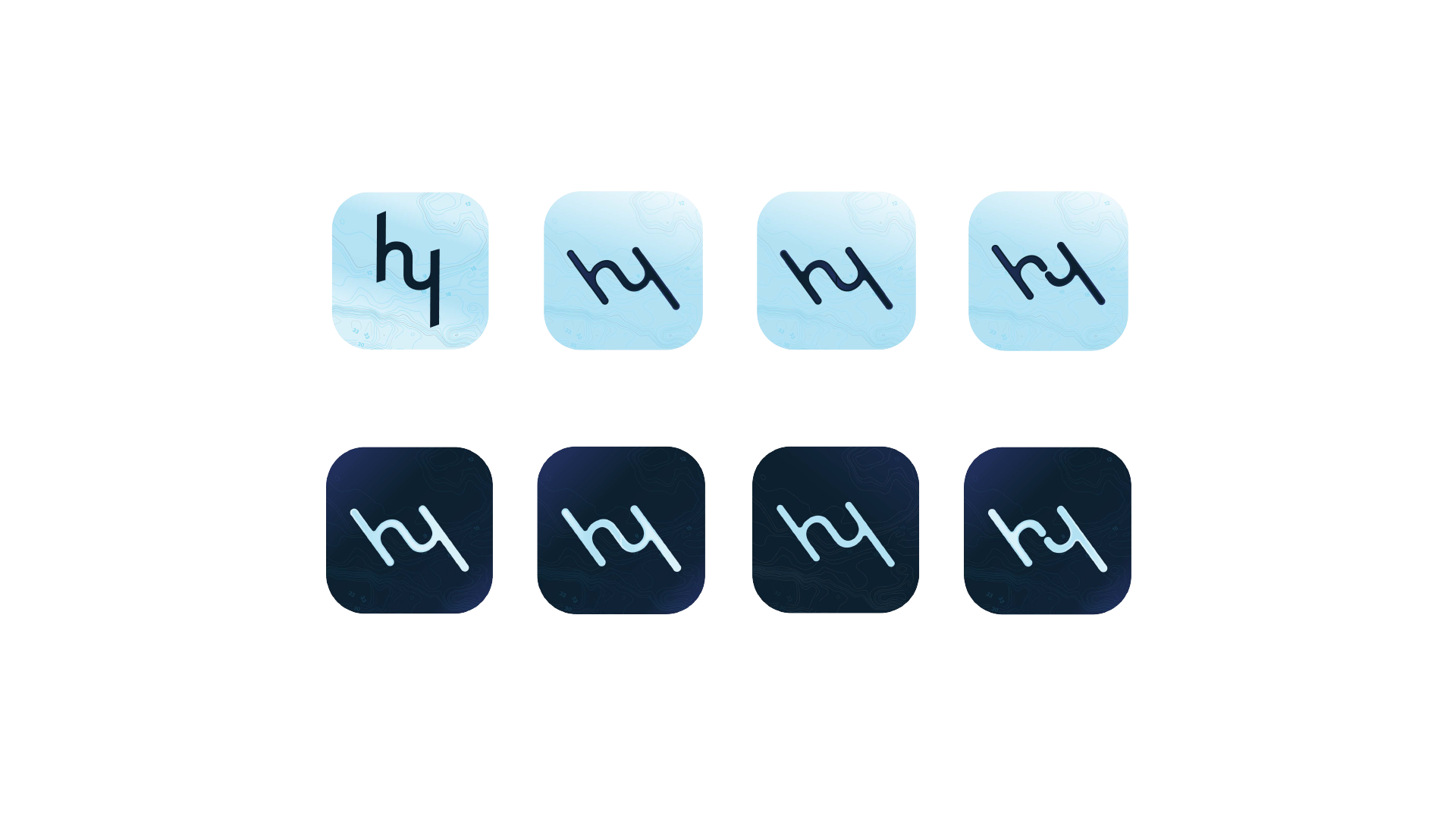
As we'd soon be designing an app icon for the brand,
we experimented with the "h" and "y" to make them more
prominent and unique.
We experimented with condensing the logo per the contemporary
design landscape, and applied bathymetric motifs to speak to the
element that inspires Hydrow.
We continued to explore how the "hy" could stand alone as an icon for
the app. The ending result shows "hy" as one unit, tiled at a -45 degree angle.
This is the stance adopted right before, “The Drive”thus the Hydrow icon
represents two entities. Hydrow and the user pushing forward in unison.
We then explored how a "split" would affect the icon.
We challenged ourselves to explore how the site could become a better
touchpoint for the brand. The result is a fluid landing page which deepens
in blue gradient as a river would.